HELLO 2023!
NEW YEAR COLORS IN DECORATION AND DESIGN
As happens every year, we are leaving another year behind us — at times challenging, at times filled with beautiful moments. And the new year arrives with new colors in every sense! At the end of each year, the leading color authorities announce the color of the year that will influence the entire design world and present it to designers. From graphic design to fashion, from interior architecture to industrial design, these colors matter to every designer — and if you want to welcome the new year by taking a look at them and gathering ideas on how to use them, you are in the right place.
“FUCHSIA” – VIVA MAGENTA
The Pantone Color Institute, a name we all know well and one of the foremost authorities of the color industry, has announced this year’s color of the year as “Viva Magenta.” Represented by the M in the CMYK color model, this shade is, as is well known, a warm pink tone created by an equal blend of blue and red light. Also known by names such as “fuchsia,” magenta is, at first glance, an exceptionally energetic and bold color. Here is what Leatrice Eiseman, Executive Director of the Pantone Color Institute, has said about Viva Magenta:
[row]
[col span=”6″ span__sm=”12″]
[ux_image id=”4550″]
[/col]
[col span=”6″ span__sm=”12″]
[ux_image id=”4544″]
[/col]
[/row]
“In this age of technology, we look to draw inspiration from nature and what is real. PANTONE 18-1750 Viva Magenta descends from the red family and is one of the most precious dyes belonging to the natural dye family. It also draws inspiration from cochineal red, one of the strongest and brightest dyes the world has ever known.
Rooted deep in history, PANTONE 18-1750 Viva Magenta reconnects us to what truly matters. Invoking the forces of nature, PANTONE 18-1750 Viva Magenta galvanizes our spirit, helping us build our inner strength.”
At a time when we are slowly leaving behind the restrictions of the difficult pandemic period that shook the whole world and trying to return to normal, it seems clear that Pantone is addressing precisely this situation and these feelings, seeking to emphasize what is essential. The pandemic pushed us all to question our very essence, while also showing us just how difficult our broken bond with nature really was. After all these experiences, magenta — one of the primary colors — symbolizes our awareness and our effort to return to nature; yet its meaning is not limited to that alone. Magenta is such a saturated, vivid color that it almost feels artificial, instantly drawing attention to itself. For these very reasons, it is also widely used in the digital universe, above all in the Metaverse. In today’s world, where we are part of nature but the digital realm has also become one of our “realities,” Viva Magenta forges a connection in this sense as well — making it a genuinely clever choice for the color of the year.
Now, let’s talk about how to use this bold color in design. Let’s admit it: especially in decoration, it is a rather challenging and risky — yet equally powerful — color. Of course, how it is used will vary from space to space; but Pantone suggests that a daring designer could unleash the color of the year in all its energy on a velvet sofa or a lacquered wall panel. Naturally, since pieces like these are not products we replace often, even if you truly love the color, buying such an item — or making it harmonize with your home’s overall decorating style — may prove difficult. Still, for those who want to embrace magenta and catch the trend, a chic pouf, throw pillows, decorative objects featuring magenta, or lighting pieces make elegant alternatives. And remember, plenty of flowers come in magenta, so that option is open to you too. 😊 Treat yourself to a bouquet, place it in your entryway or living space, and enjoy the color of the year accompanied by the lovely scent of fresh flowers.
Starting with the choice of Viva Magenta, we can see that this year’s color trends revolve around a return-to-nature theme and colors drawn from the natural world. Looking at the other predicted colors, we again encounter the soothing tones of natural hues. Whites and grays are giving way to earth tones, as colors become more neutral while shifting toward warmer shades.
“PASTEL LAVENDER” -REDEND POINT-
Another well-known paint brand, Sherwin-Williams, has named its color of the year “Redend Point” — a pastel yet warm lavender tone. A touch more colorful than neutral shades but far from the vibrancy of pinks, this color makes a beautiful alternative to the tones that first come to mind when we think of earth colors. Pairing exceptionally well with white, it also strikes a calm, versatile harmony with wood tones.
Reminiscent of a soft blush tone, this color is perfectly suited to a wall in your entryway, your reading nook, or your textiles. As with any paint, however, finding the right shade is essential. If you want to use it on a wall, make sure you choose your paint under the right lighting, and always test it on the wall first. This advice applies to every color, of course, but it matters even more with such specific shades. If you plan to use Redend Point — whose stylish presence is completed with a warm touch, especially alongside oak tones — in your bedroom, you should take a look at Demontha wardrobes and nightstands!
[row]
[col span=”6″ span__sm=”12″]
[ux_image id=”4545″]
[/col]
[col span=”6″ span__sm=”12″]
[ux_image id=”4546″]
[/col]
[/row]
“WARM BEIGE”
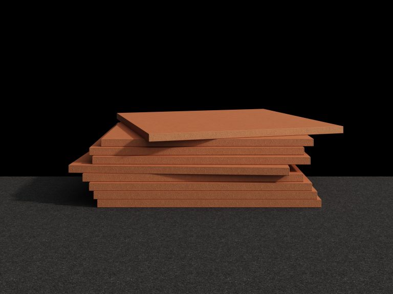
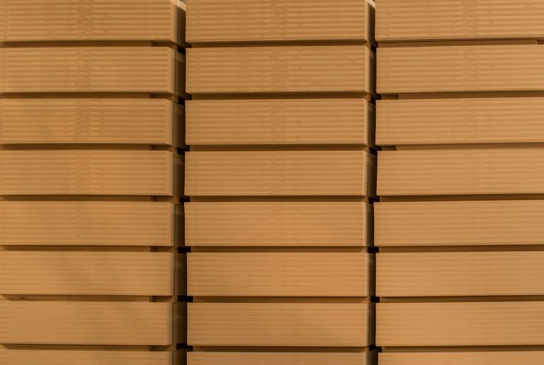
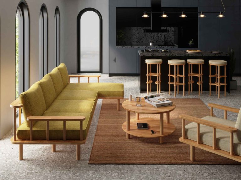
Another color we will be seeing plenty of is “warm beige.” Referencing stone and earth tones, beige is a color that feels both calm and energizing when the right shade is used. Combining this tone with a variety of textures in your decor is an easy and remarkably effective way to create depth in a space. Vivid, dominant colors can become tiring over time in the living rooms where we spend most of our hours — and beige is ideal in this regard. It blends effortlessly with other colors, making life easier and serving as an “undertone.” Whether you prefer a grounded decorating style with dark wood tones, or a more bohemian, Scandinavian feel with light-colored furniture. Demontha’s beech coffee tables, bookcases and many other pieces designed for your living spaces can be a beautiful furniture choice for a decor in beige tones.
[row]
[col span=”6″ span__sm=”12″]
[ux_image id=”4549″]
[/col]
[col span=”6″ span__sm=”12″]
[ux_image id=”4548″]
[/col]
[/row]
“SAGE GREEN”
Green is a color that never goes out of style. According to the color experts who know the industry best, soft shades of green look set to be among the other colors we will see in 2023. Harmonizing beautifully with beige tones, green may well be the first color that comes to mind when we speak of natural hues. This particular green — a shade of green softened with gray — will be a truly beautiful and striking choice, especially for creating that calming feeling you want in bedrooms. It also works on a kitchen wall or on your kitchen cabinets, and even as a tile color in bathrooms. You can use green in virtually any space.
[ux_image id=”4547″]
To sum up, nearly all of the trend color recommendations and forecasts feature earth tones, driven by the idea of bringing the natural into our spaces. Perhaps most of us are already drawn to these shades — because we love what is natural, and we now care about that more than ever, in every respect. At the same time, we all know very well the power colors hold over our senses and emotions. The new year is a wonderful excuse to refresh our homes — where we spend most of our time — with the colors we love and make a few changes. Following the trend can feel good, but what matters most, as always, is what you love. Your home, your decision! :) An entryway or balcony wall brightened with a can of paint in your favorite color, decorative objects and throw pillows in shades you adore after clearing out the pieces you no longer like, or sometimes simply a flower… Small changes can sometimes make you happier than you would expect. It is well worth a try — happy new year!
Canan PERVİS